MOST

Revamping Korea's

First Mobile Refueling App

Duration

Duration

Duration

Sep 2017-Aug 2018

One Year

Sep 2017-Aug 2018

One Year

Sep 2017-Aug 2018

One Year

My Role

My Role

My Role

Front-end (My Team)

Back-end

Product ops

Total 50+ people

Front-end (My)

Back-end

Product ops

Front-end (My Team)

Back-end

Product ops

Total 50+ people

Team

Team

Team

Product Manager

Design Manager

Product Manager

Design Manager

Product Manager

Design Manager

Client

Client

Background

Adapting to SK's

new brand identity.

History
History
SK Networks operated 350 gas stations in Korea. 

In 2017, they launched the nation’s first refuel payment mobile app, which provides a more convenient and faster checkout experience.
SK Networks operated 350 gas stations in Korea. 

In 2017, they launched the nation’s first refuel payment mobile app, which provides a more convenient and faster checkout experience.
SK Networks operated 350 gas stations in Korea. 

In 2017, they launched the nation’s first refuel payment mobile app, which provides a more convenient and faster checkout experience.
Project Goal
Project Goal
Project Goal
In 2018, SK Networks rebranded their business and wanted to revamp their existing app to enhance the user experience and add more features.
My Role
My Role
My Role
Over the course of a year,
I led the front-end team as both a product manager and design manager, working with two other teams and 50+ people.
Over the course of a year, I led the front-end team as both a product manager and design manager, working with two other teams and 50+ people.
Over the course of a year,
I led the front-end team as both a product manager and design manager, working with two other teams and 50+ people.
Problem Definition

Balancing priorities

Balancing priorities in cross-functional team.

in cross-functional team.

My approach

This project involved over 50 people divided into three teams: front-end, operations, and back-end. As the PM of the front-end team, I began by identifying each team's priorities and translating them into UX flow wireframes and a visual design system.

UX Design

Designing a user-centered

Designing a user-centered information architecture.

information architecture.

How to organize
key features:

How to organize key features:

In the project's onset, we grappled with numerous new features and varying team priorities. We advocated for a user-centered information architecture, emphasizing that customers are the primary stakeholders.
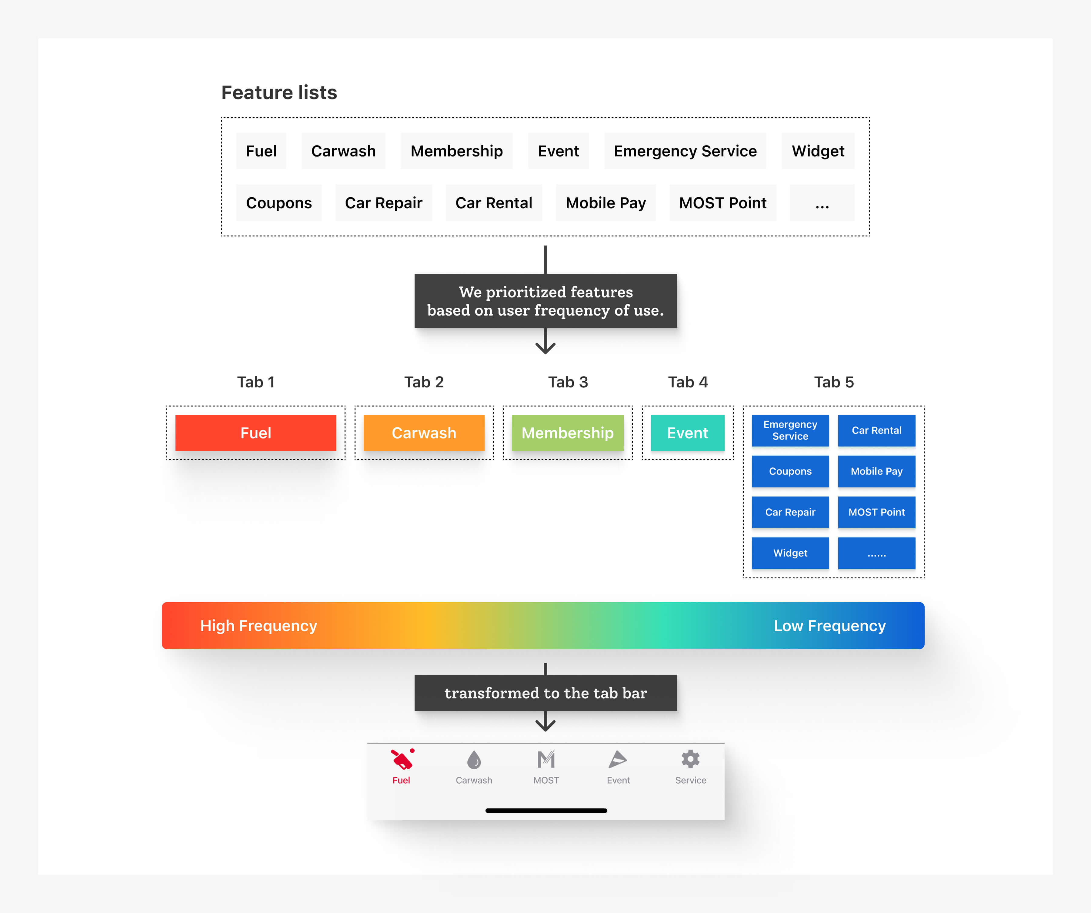
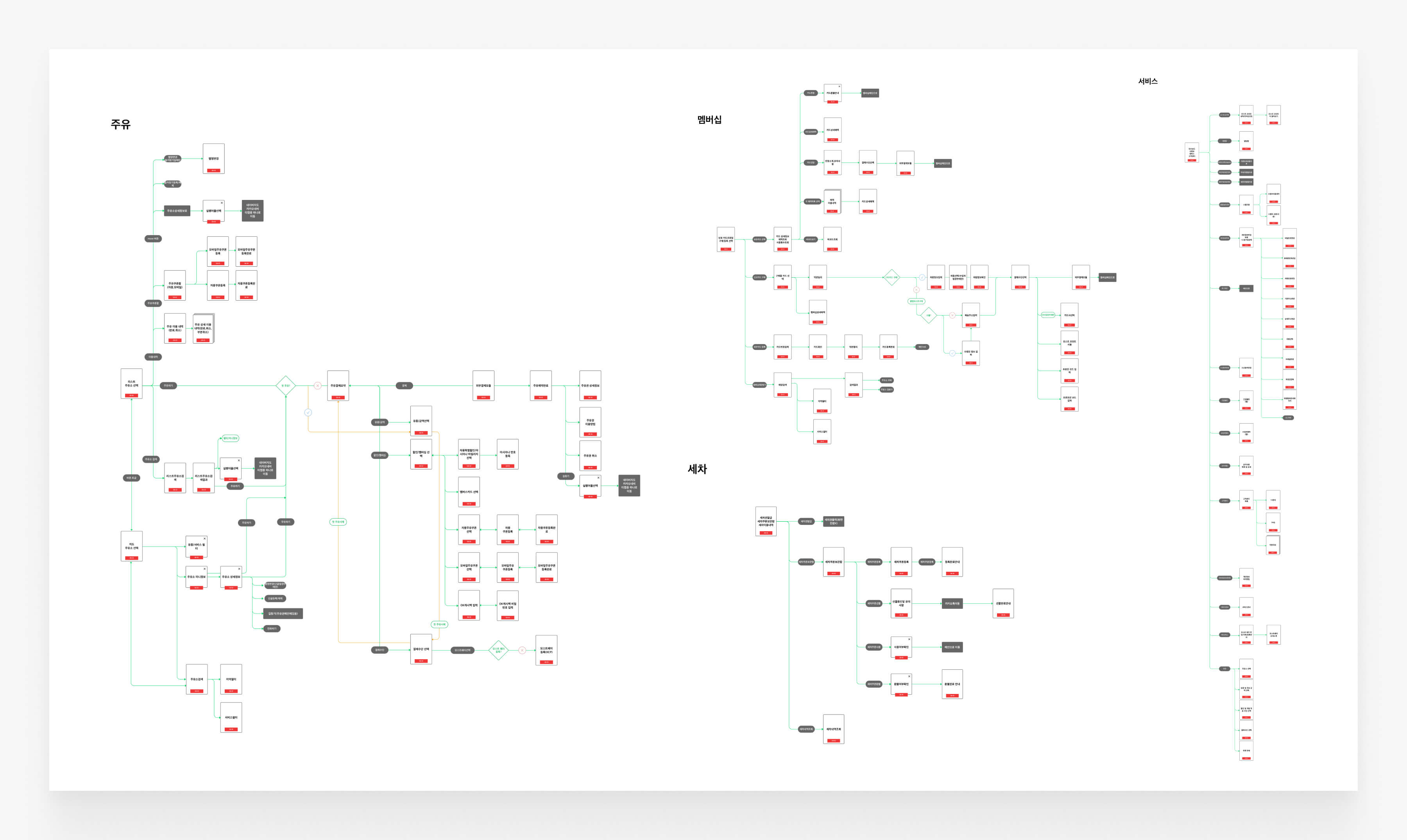
UX Flow

We created a user flow considering all possible scenarios.
Now we have the total number of screens and the features that need to be developed.

Design Rational

Make it simple to finish tasks.

Streamlining
user journey

Streamlining user journey

The app's main advantage is its swift, hassle-free gas station checkout, replacing physical cards and coupons. With a few app clicks, users can checkout quickly. We aimed to expand this value proposition to other newly launched services, while also improving the core value.

Improving the UX
based on user data

Improving the UX based on user data

During our research, we discovered an interesting user pattern where users tend to refuel the same amount of gas at the same gas station. To reflect this behavior, we designed a main page that displays the user's refueling history, making it easy for them to select the desired option.

New Feature:
One-Tap checkout

New Feature: One-Tap checkout

We designed a significantly faster checkout experience compared to previous apps. In addition, we introduced a 'one-tap refueling' option that enables users to complete the checkout process with just one tap.

UI Design

Content-driven design.

Visualizing
multiple data

Visualizing multiple data

To enhance user focus on their tasks, we used large, easy-to-scan text with minimal decorations. Additionally, we utilized red highlight text to grab attention for discounts, branding, and call-to-action buttons.

Branding & Marketing

Native advertising

without interfering with the UX.

Designing a
Ad experience

Designing a Ad experience

The marketing and events sections are important to both businesses and users, but they should not be intrusive. To address this, we allocated a designated advertising space that doesn't interfere with the overall user experience while allowing for efficient marketing.

Impact

Metrics

1,000,000+

App downloads

1.46M

Membership subscribers

327

Gas stations distributed

18%

Increase in quarterly earnings

Let's Get In Touch!

©Hyun Bang 2023 Portfolio. All Rights Reserved.